
5 CRUCIAL TIPS FOR HOME PAGE DESIGN WHEN LAUNCHING YOUR NEW PRODUCT
So you’ve built a new product or service, or SaaS, or whatever you want to call it. Now, you are designing your new website home page. You have spent a great deal of time (hopefully) reading the do’s and don’ts of how to present your new product to your website visitors, or you are going to hire a design company to do the work for you. But are there any tricks you can implement to help you convert these hard earned visitors into sign ups? Well, here I’ll show you 5 crucial tips for home page design when launching your new product. these few important tricks that I’ll share with are important conversion metric (visitor>sign up).
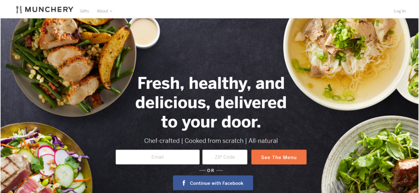
 Munchery’s, clear centered text blends great in the background and leaves all the focus to the button and form. You still get a sense of what the product is about, food.
 Jobmarker.io
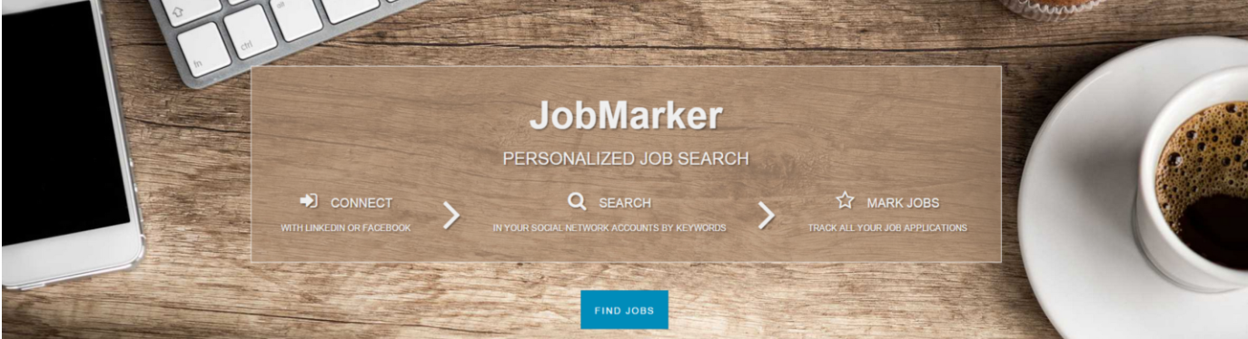
I spent a great deal of time designing a homepage with the help of a good friend and a talented designer, Shahar Ben Ari, and the efforts were not in vain. I spent countless hours finding the right image with the right composition, as I wanted a spotlight on the center headline and button. As you can see all elements correspond with the work environment and there is a bulk space in the middle that leaves all the spotlight to the right elements – the sign up button.
Jobmarker.io
I spent a great deal of time designing a homepage with the help of a good friend and a talented designer, Shahar Ben Ari, and the efforts were not in vain. I spent countless hours finding the right image with the right composition, as I wanted a spotlight on the center headline and button. As you can see all elements correspond with the work environment and there is a bulk space in the middle that leaves all the spotlight to the right elements – the sign up button.
 JobMarker.io, again. As you can see, I used 3 simply designed, well known icons and very short texts. The conversion rate was amazing, around 25%.
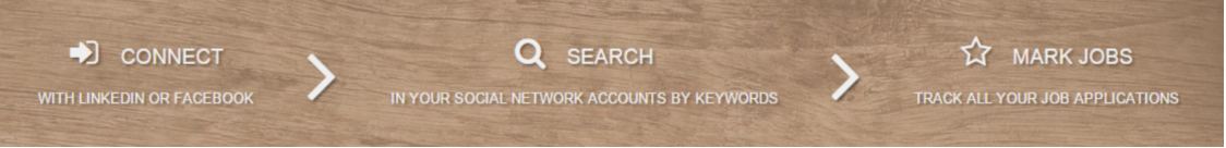
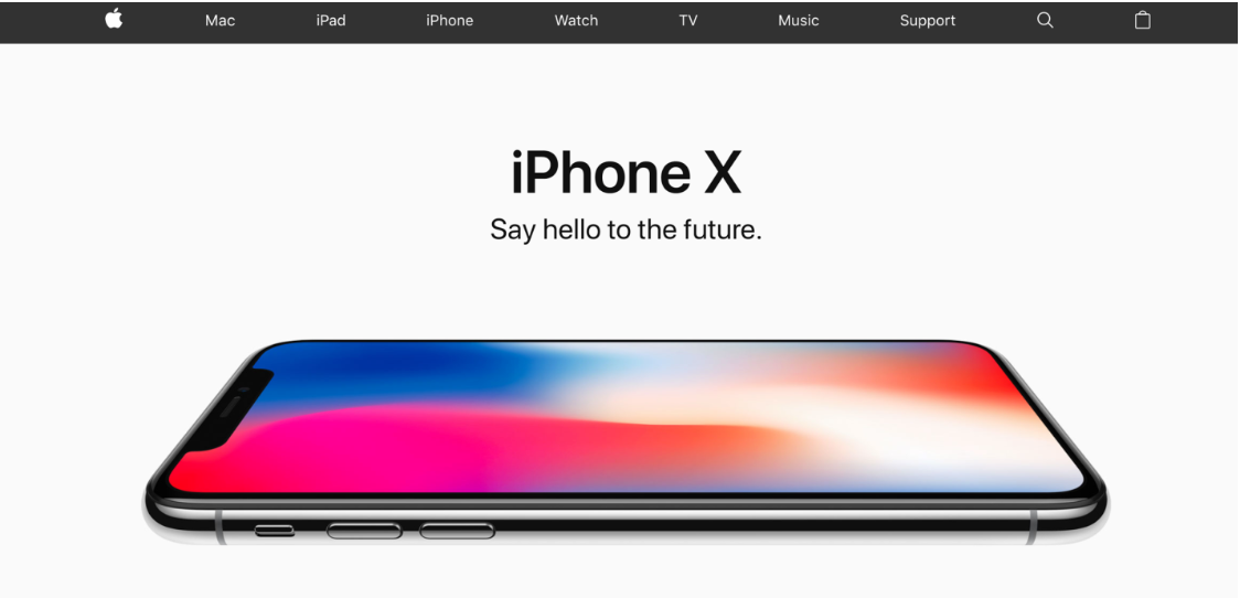 Well, the first example is from a “semi known” company called Apple. Their short and to-the-point H1 and H2 are so smart in their simplicity. Clearly, it’s easier when everyone knows your brand, nevertheless, keeping it so short puts all the spotlight on their product.
 Gong.io is a young startup that is doing it right. Clear, simple and short yet full of details, the page makes the user want to read more or watch the demo. Thumbs up!
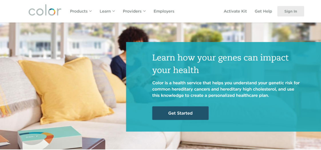 A great example of using a longer sentence but still to the point is Color’s old headline picture. It’s not easy to explain what they do in few words, so they went with a longer version. It is still easy to read and provides all the info you need in order to become intrigued and continue exploring their product.
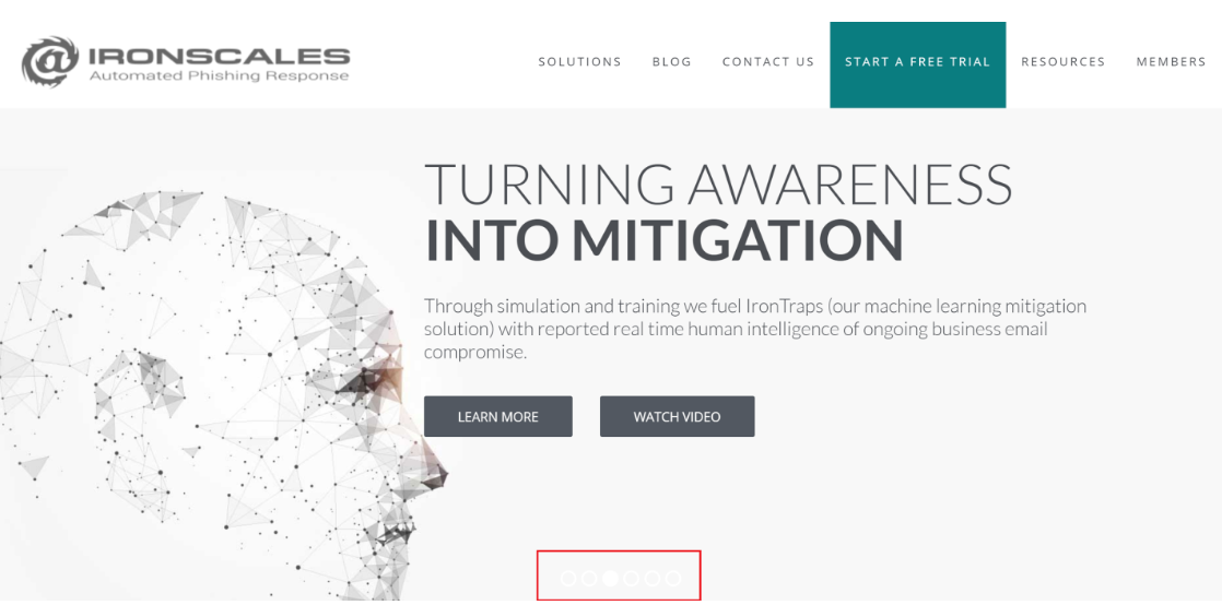
 On the other hand when you click on the image slider and reach the third image, look what happens—the slider point bar is almost invisible. White text over practically a white background is a recipe for disappearing elements. They could solve it by choosing a different background color or adding a darker footer to this image.
 Essentially Geared Wine Co. sells wine in a can. In such a traditional— some might say elitist—industry, selling wine in a can is almost blasphemy. They identified their audience as young and up-to-speed millennials, and immediately on their homepage shared an atmosphere video that boosts their product appeal. A tactic that is well executed. They also addressed the issue of wine in a can by providing a full section on this subject. They called it Screw Corks…funny. I have a feeling it won’t fly in France.
 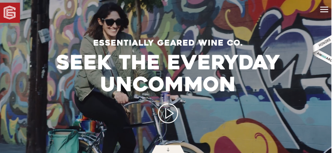 So there you have it, 5 crucial tips for home oage design when launching your new product the right way and turn visitors into sign ups or downloads from your home page.
Don’t forget to check out our בלוג and sign up for our newsletter in order to receive valuable tips and tricks about marketing and business in the digital area.
If you have any questions, feel free to comment or send us a message.
Until next time—stay healthy and positive!
So there you have it, 5 crucial tips for home oage design when launching your new product the right way and turn visitors into sign ups or downloads from your home page.
Don’t forget to check out our בלוג and sign up for our newsletter in order to receive valuable tips and tricks about marketing and business in the digital area.
If you have any questions, feel free to comment or send us a message.
Until next time—stay healthy and positive!
Image composition and colors
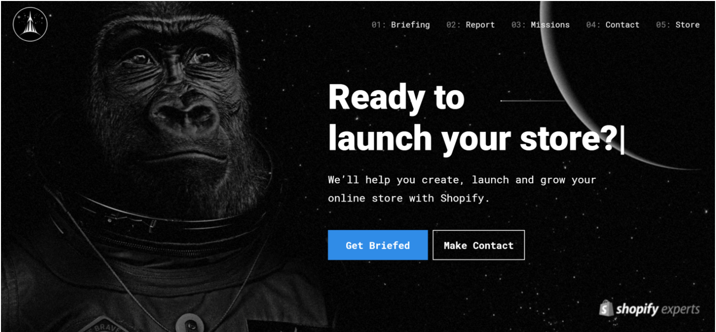
You have decided to go with a stunning image as a background in the top section of your website. Cool, this strategy actually works for many brands. It’s important to remember that the image shouldn’t just be pretty and that it interacts with other design elements; it must always support conversion. What do I mean by that? You are trying to convert visitors to sign ups (then to paying customers), so the image shouldn’t distract the user’s eye from the button or form. The image should blend nicely with the background. Composition – how the elements inside the image are organized. What is a great converting image composition? When the elements support the conversion path and leave all the focus on the button or form (or other action elements you want the user to take). Examples: Shopify experts Brave the Skies, aligned the text on their page to the right and the image background main element is aligned to the left.
Munchery’s, clear centered text blends great in the background and leaves all the focus to the button and form. You still get a sense of what the product is about, food.
Jobmarker.io
I spent a great deal of time designing a homepage with the help of a good friend and a talented designer, Shahar Ben Ari, and the efforts were not in vain. I spent countless hours finding the right image with the right composition, as I wanted a spotlight on the center headline and button. As you can see all elements correspond with the work environment and there is a bulk space in the middle that leaves all the spotlight to the right elements – the sign up button.
Feature “how it works” on your home page
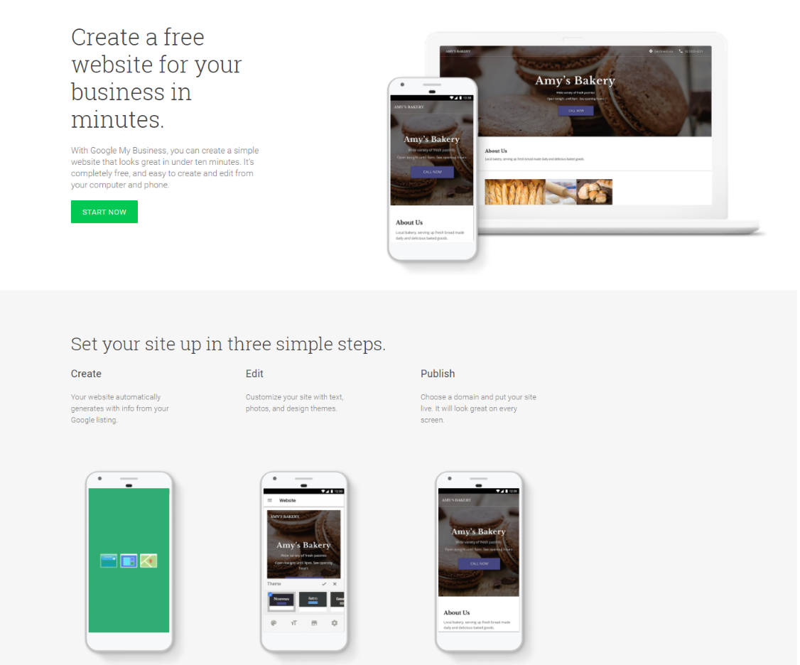
It’s not always right to use this trick but I found it very useful when presenting new products. It helps to reduce uncertainty when the user interacts with your product for the first time, especially when you don’t have a strong brand. The trick is to show how easy it is to use your product and to reveal what is going to happen right after the click. Don’t use this trick if you send users directly to a payment page, it is misleading. A few important notes: Don’t lie. Users are smart and will punish you if you misled them. Be brief. Think about it as a super short headline (1-2 words) and a short description, preferably one short sentence. Use icons. It helps to visualize the process—and you know an image is better than 1000 words. Examples: Even the guys at Google for business used this trick. Create. Edit. Publish. So simple, I want to create a website immediately.
JobMarker.io, again. As you can see, I used 3 simply designed, well known icons and very short texts. The conversion rate was amazing, around 25%.
Tagline and description. Main benefit in H1. Short description in H2
If you can’t say it in one sentence, something is probably wrong. Most people tend to oversell their product. The result is usually a website with too much text, trying to explain things that are not important at such an early stage of the user’s decision process. The home page header is like a welcome sign, it should invite the user to keep on exploring your solution and to read more. It should be designed well and to the point. in order for the user to keep on browsing your website. So please keep it short and simple! If you feel obligated to blurb a lot on your product, there are better places for it—your blog or further down the home page. If you must explain more (and there are cases in which it’s clearly better to do so), try to keep it as simple and to the point as possible. Use a sentence and not a paragraph. Some examples of great homepage taglines and descriptions (H1 and H2). Well, the first example is from a “semi known” company called Apple. Their short and to-the-point H1 and H2 are so smart in their simplicity. Clearly, it’s easier when everyone knows your brand, nevertheless, keeping it so short puts all the spotlight on their product.
Well, the first example is from a “semi known” company called Apple. Their short and to-the-point H1 and H2 are so smart in their simplicity. Clearly, it’s easier when everyone knows your brand, nevertheless, keeping it so short puts all the spotlight on their product.
Gong.io is a young startup that is doing it right. Clear, simple and short yet full of details, the page makes the user want to read more or watch the demo. Thumbs up!
A great example of using a longer sentence but still to the point is Color’s old headline picture. It’s not easy to explain what they do in few words, so they went with a longer version. It is still easy to read and provides all the info you need in order to become intrigued and continue exploring their product.
Colors contrast
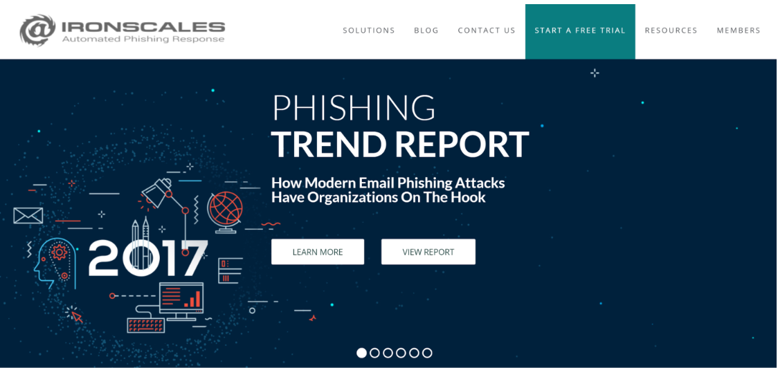
In order for your text and buttons to stand out from the header of your page, you must choose the right colors. I often see companies forget the importance of readability. You have invested time and money creating a great copy that is easily read and understood, but then you have put it on a web page using colors that do not contrast well. By doing so, you’ve lost many users who won’t read your content the right way, or who miss an important word here or there. Be smart, think of contrast when presenting your new product! Let’s take a look at IronScales who used to have both good and bad examples on the same home page. The good – Check out the great contrast that is readable by basically everyone. You can’t go wrong with white text on a dark blue background.
On the other hand when you click on the image slider and reach the third image, look what happens—the slider point bar is almost invisible. White text over practically a white background is a recipe for disappearing elements. They could solve it by choosing a different background color or adding a darker footer to this image.
Use video.
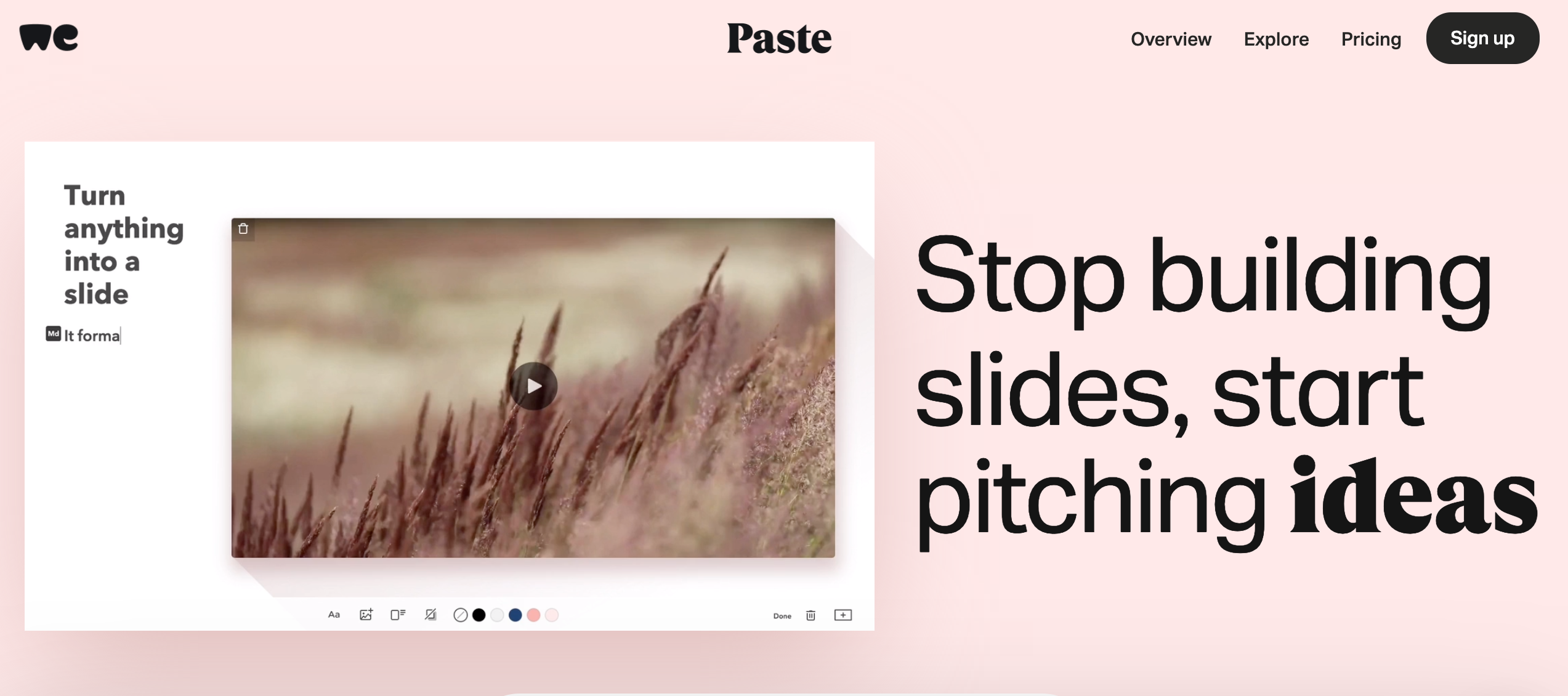
The last tip of our 5 crucial tips for home page design when launching your new product is videos. In today’s hectic media exposure, you must get to the point really quickly. Millennials or younger generations who are used to consuming a huge amount of data all day long, tend to get bored quickly. They don’t like to read too much, so it seems. The best way is to show them your product intro using a cool and to-the-point video. Paste by We Transfer is a well designed app, their home page is well designed too. All the focus is on the product and the download button. Still not convinced? Watch their video if you don’t want to read further. Pretty cool.Essentially Geared Wine Co. sells wine in a can. In such a traditional— some might say elitist—industry, selling wine in a can is almost blasphemy. They identified their audience as young and up-to-speed millennials, and immediately on their homepage shared an atmosphere video that boosts their product appeal. A tactic that is well executed. They also addressed the issue of wine in a can by providing a full section on this subject. They called it Screw Corks…funny. I have a feeling it won’t fly in France.
So there you have it, 5 crucial tips for home oage design when launching your new product the right way and turn visitors into sign ups or downloads from your home page.
Don’t forget to check out our בלוג and sign up for our newsletter in order to receive valuable tips and tricks about marketing and business in the digital area.
If you have any questions, feel free to comment or send us a message.
Until next time—stay healthy and positive!